P
U
F
UX/UI Design, Branding, UX Research
F
D
’
M
A
Responsive website re-design and re-brand for client’s personal portfolio showcasing personal artistic projects and fashion looks.
T
O
Client
Puff D’Mato, owner of Murphy’s, an entrepreneur and artist.
Design Challenge
Currently, Puff’s website has the basic features but no direction when it comes to the visual design and branding of the website. He would like to incorporate more brand colors, as well as update the organization of the pages.
Scope
UX Researcher, UX/UI Design, Branding
80 Hours
Research and Insights
Through competitive analysis, some common features were found:
impactful homepage to set the tone and grab users’ attention
creative and thoughtful branding throughout
simple and effective navigation
Interviews highlighted some key aspects that impacted design decisions:
users favored a unique visual design that allowed the content to breathe and stand on its own without overwhelming the users
social media handles are important, as they are the main form of media to discover individual websites
users tend to be more critical of visual designs, as impact weighs heavily on how users engage with the website
Interviews
The goal of the interviews is to understand the pain points, habits, and discovery of users when it comes to personal creative websites.
AGE
22-24
GENDER
Male
Female
D
E
M
O
G
R
A
P
H
I
C
Findings
users’ motivation to discovering an individual’s portfolio is often for inspiration for their own personal projects
social media is the most common source of discovery
75% of participants put a high importance on the “about me” section while 100% of participants valued the content as the most important
100% of participants found branding to be important, yet lacking consistency or too uninspiring
many portfolios lack personality and thoughtful design
LOCATION
New York
Chicago
PROFESSION
Retail & Freelance Artist
Concept Designer
Fashion Designer
User Persona
Bluey Smith
Concept Designer
Age: 28
Location: Los Angeles, CA
Archetype: The Adventurer
Bio: Bluey is a successful concept designer at a luxury brand. Without any formal training, Bluey was able to get to where he is through hard work, talent and meeting the right people. Bluey loves to take time to step back from work and enjoy life. He loves experiencing new things and is constantly finding inspiration from his surroundings.
“I want to feel inspired, when I’m looking at something, I want to feel some type of emotion, because life’s too short to live it mundane.”
Core Needs
Pain Points
Inspiration from designers/artists
Community of people who’re open minded and artists in their own way
Research
Portfolios/websites aren’t unique, all looks the same
Doesn’t draw out any emotions and has no voice
Often hard to discover
Design
Created to display Puff’s work and personality through a thoughtful and creative design.
Information Architecture
Site Map
Working with the client, we decided to stay true to his favorite time in the 90’s and chose a color palette tied to those memories. The typography similarly reflects the client’s branding, in that a more rounded and graphic font would emote the edgy and fun spirit of himself and his brand.
Branding
Typography
Concerto One
Color Palette
#9D0202
Primary colors for a modern retro design
Nunito Sans
Logo
#EAB200
#002363
Wireframes
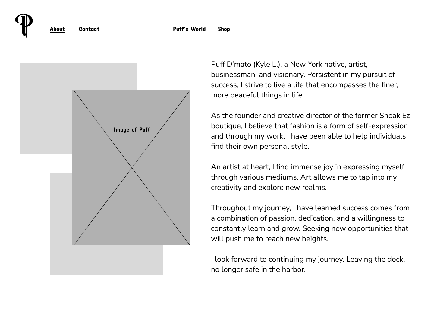
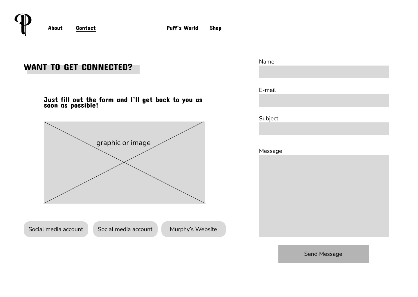
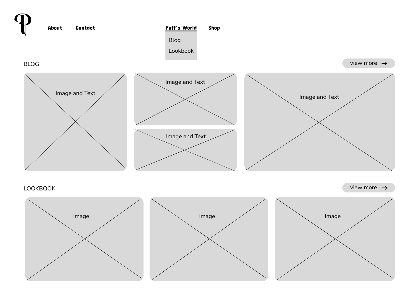
The wireframes mapped out the basic pages. User interviews indicated heavy importance on the ‘about’ section leading to categorizing two sub groups of navigation, grouping About and Contact to the left while putting Puff’s World and the Shop center.
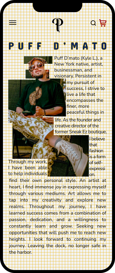
Mobile version had image resizing with a hamburger navigation on the top right with the logo on the top left for an easier experience on a smaller screen.
Brainstorming
Inspired by pixel designs, I applied my own version to images.
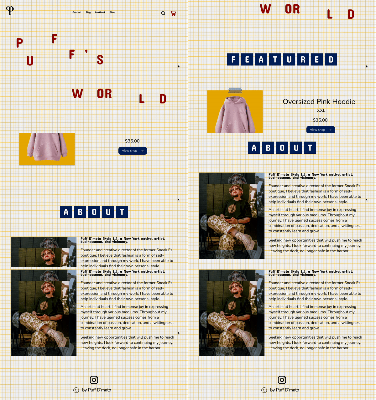
The initial design tied together aspects of retro designs from the 80s and 90s while keeping the basic structure simplistic so that the content has space to breathe.
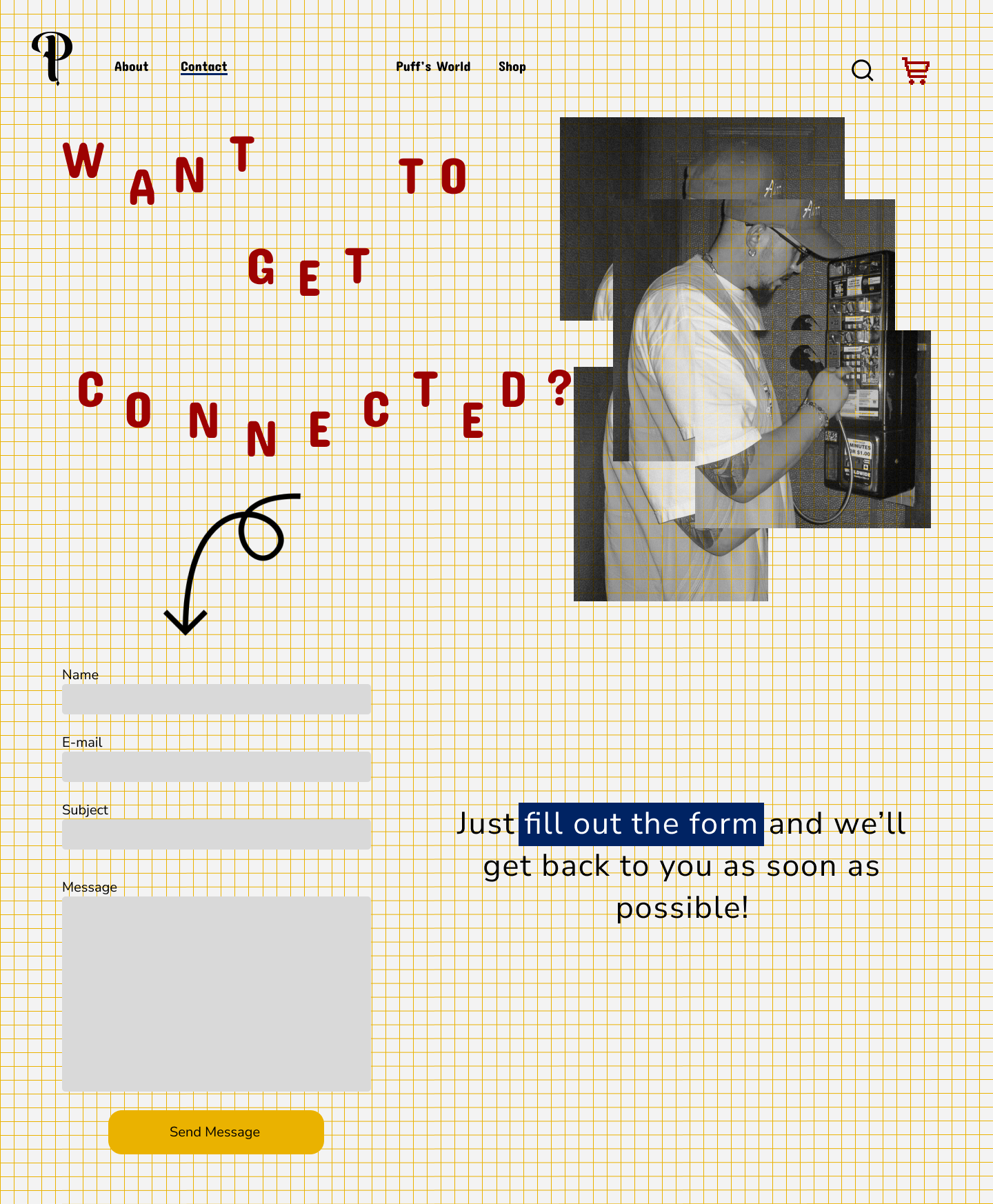
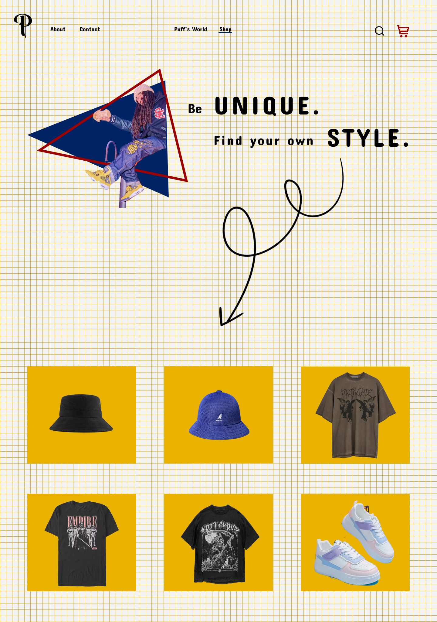
Client feedback and interviews expressed a minimalistic design with the branding in mind. I decided to go with a grid background to set a graphic feel while incorporating one of the main brand colors from the palette.
Hi-Fidelity Wireframes
The mobile version’s initial design played around with the navigation, with the logo placed top center and the cart and search functionalities to the right with the hamburger navigation to the left. With the shop being one of the major features of the website, I felt it was important to keep the cart separate from the main navigation.
User Testings & Iterations
Participants found the overall design to be visually creative and fun.
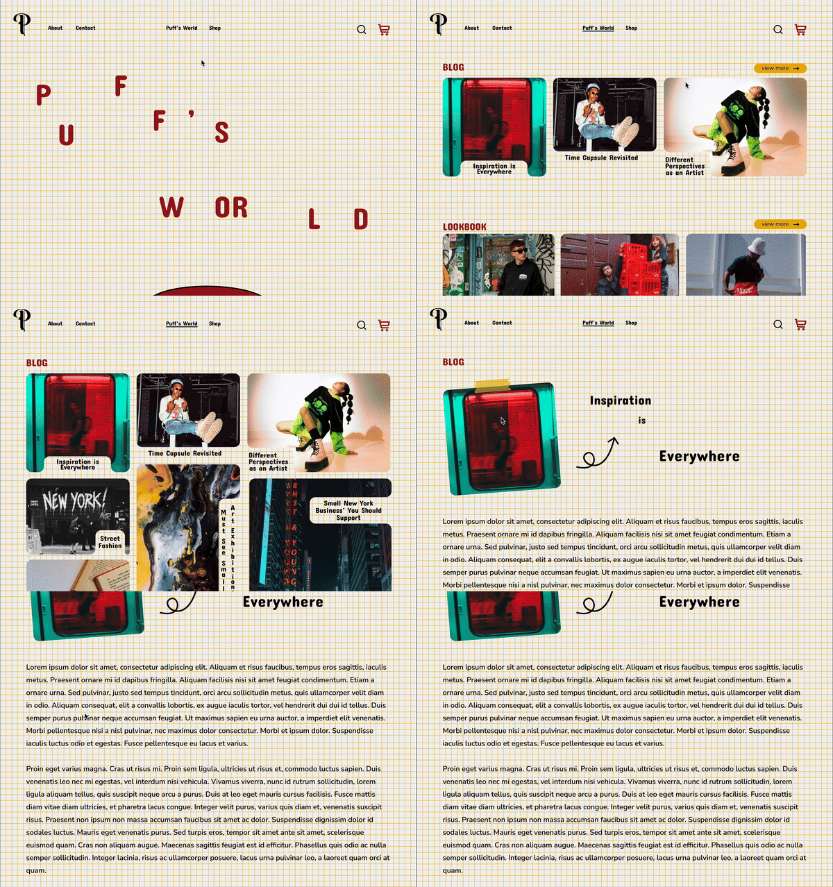
100% of the participants found the navigation to be intuitive but having two subgroups of navigation led to a longer completion time. Centralizing the navigation and reorganizing the pages limited eye tracking.
Some of the participants questioned the necessity of the search functionality, which led to the decision to remove the feature completely.
Participants were tasked to navigate to a blog article. Testings showed the task intuitive yet, could be streamlined by making the blog page it’s own category in the top navigation.
Before
After
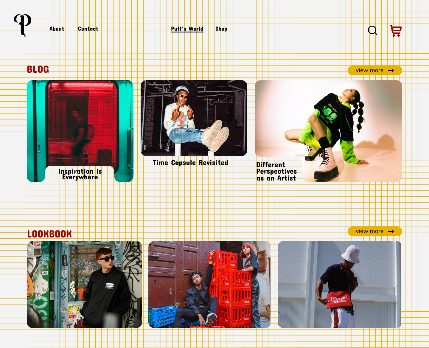
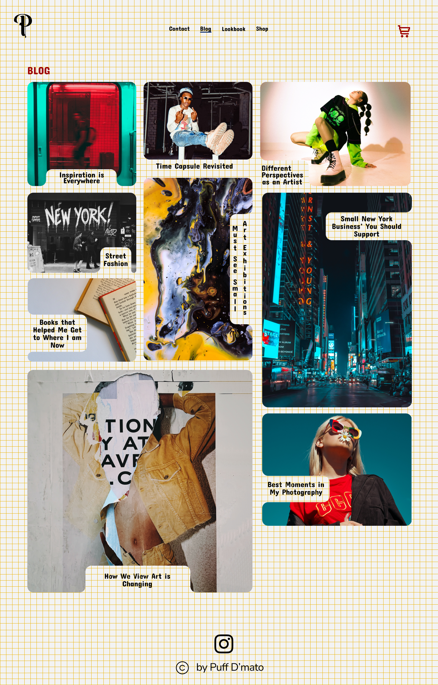
Taking inspiration from Pinterest, the blog page gives a unique gallery view with organic shapes for a more personalized touch.
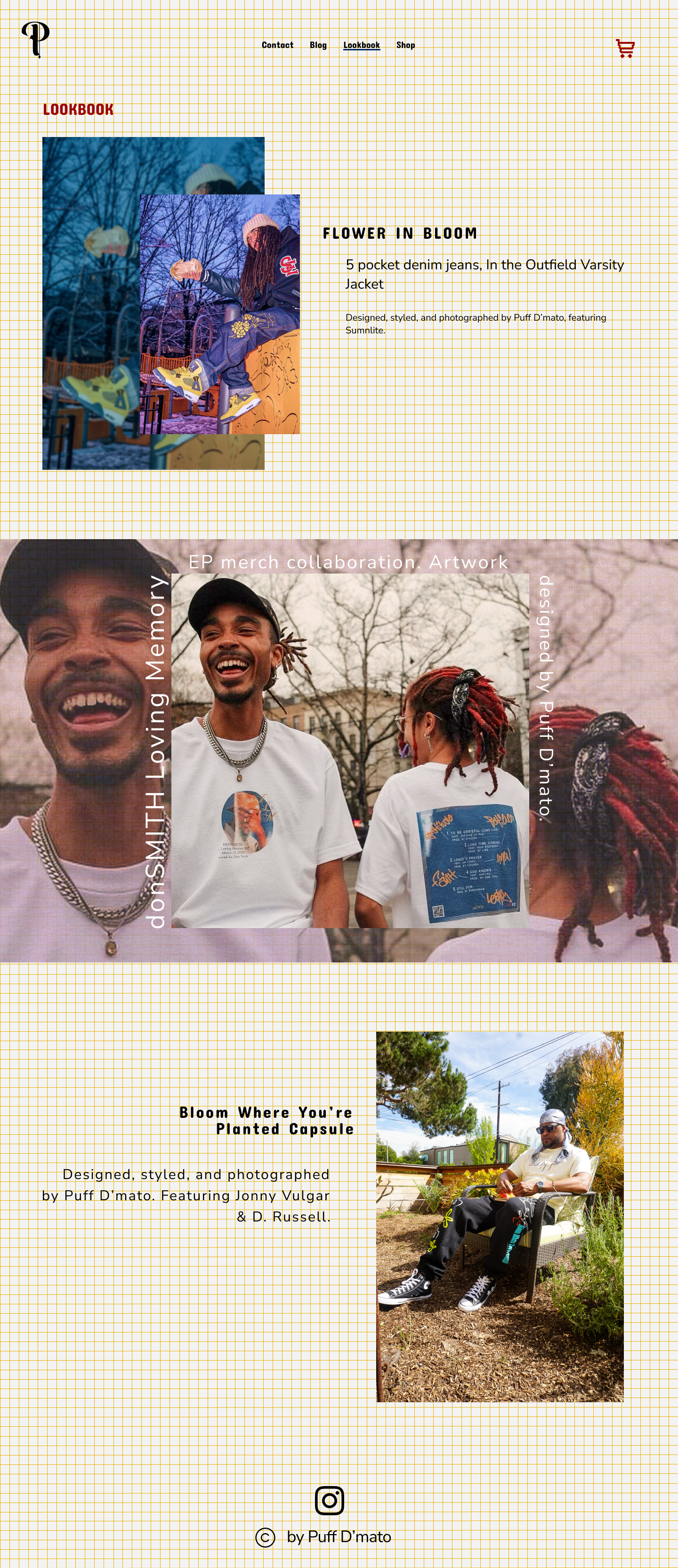
The lookbook page took more editorial inspiration to set itself apart from the blog page. To allow the content to stand on its own, I relied on a more creative placement of the images to keep the users engaged.
The mobile design offered different challenges. Resizing the images while making the font visible was especially difficult when it came to the blog page.
The center placement of the logo allows for eye tracking and getting to the home page, while the cart stays on the top right, as it’s a main function of the site.
Prototype
Jump to the interactive prototype.
Wrap Up
Working with Puff D’Mato, I’ve had the opportunity to push the boundaries with creativity. I was able to build a functional design that incorporated the brand voice of my client. The wireframes gave me the structure of the initial organization of the pages while the usability testings gave me the guidance for the final iteration.
Nothing is truly final in design. The current displays are only stock photos, as the client is working on his current designs. As this is an ongoing project, I look forward to continuing to work with the client to launch the website.

