Sephora: Adding a Feature
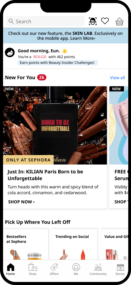
Sephora is already a complex app with a very expansive database that holds a wealth of customer information. This AI feature explores how a face scanning feature could widen the user experience.
UX/UI Design, UX Research
Research
Secondary Research
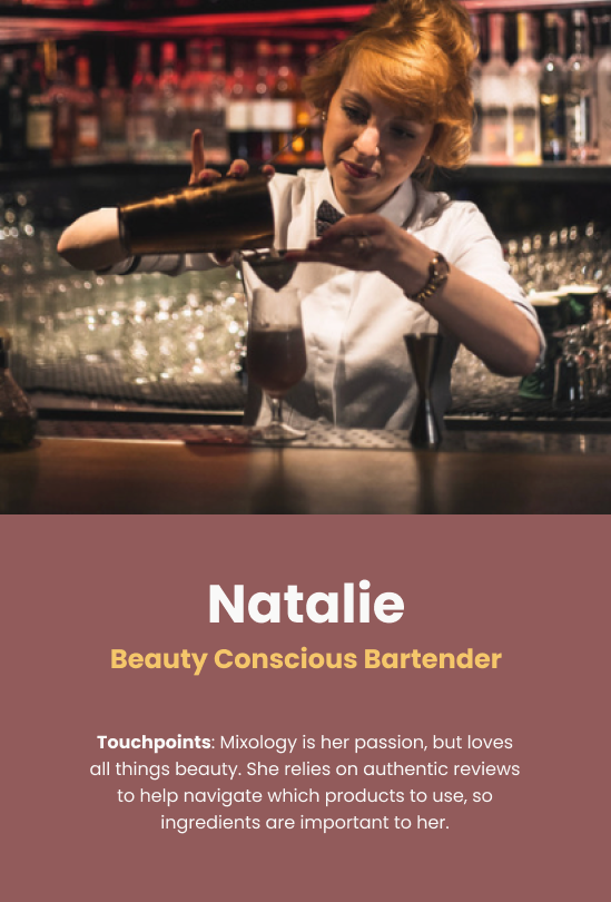
User Personas
User Interviews
Affinity Map
Process
Design
Branding
Sketching
Wireframes
Testing
Prototyping
User Testing
Iterations
Research
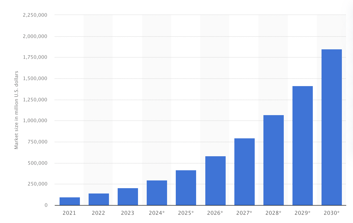
Trends are projecting the biggest uptick in AI usage within social media platforms, but companies from all industries are already beginning to incorporate AI within their platforms. There’s still a gap between users and AI, as it’s evolving quickly and has space to improve, that’s why, adding an AI feature to Sephora’s mobile app would not only improve their business but also enhance the user experience.
Key Findings:
Discovery of New Products
Affinity Map
Artificial intelligence is expected to reach USD 1.8M by 2030.
Source: statista
Secondary Research
Ulta Beauty
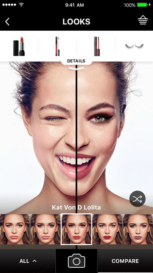
Ulta’s mobile app showcases how AI features enhance the user experience. They offer 3 key features: try-on, shade finder, and skin analysis in their “glam lab”.
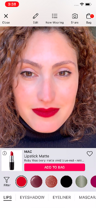
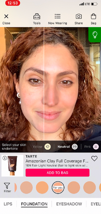
Currently, Sephora only provides a try-on and a shade finder feature on their app.
You can see, that the current feature is focused on helping users find the right makeup and not really for skincare.
User Interviews
50% of participants wear makeup for pleasure while 100% of participants wear makeup to feel put together
75% of participants have a distrust of AI and its accuracy
100% of participants have used trial and error in finding the right product for their skin type
I usually discover new products through social media ads, instagram, influencers or on TikTok shop
If there’s something I’m specifically searching for, like a new formula, I’ll do my own research before buying
Honestly, I buy new products after getting recommendations from friends
User Persona
The goal of the interviews was to understand user behavior and shopping habits, thoughts on AI, and overall opinions when it comes to beauty.
75% of participants value authentic reviews to guide them in finding different/new products to use
100% of participants do their own research on ingredients when it comes to skincare
AI Skepticism
I feel like AI technology isn’t 100% accurate, so I wouldn’t trust it to find my match
I prefer going in-store to find my color match, just cause I feel like those AI stuff wouldn’t take into consideration lighting and oxidation of formulas
I still think AI technology needs more time to develop , but skincare makes more sense than makeup, at least I’d be willing to try it for my skincare over finding my shade
Shopping Frustration
The worst is when Sephora won’t have a product I’m searching for, so then if I’m really in a pinch, I need to use another product
Often times, I need to do my own research on products before making the decision to purchase the product, so I find myself doing a lot of back and forth between different pages on my phone
I hate having to physically going into the store, I’m more of a convenient shopper, but sometimes I just need to go in to buy a product
From research and interviews, I wanted to identify potential users for a humanistic perspective.
Branding
Sephora uses a simplistic color scheme: black and white as their primary colors, usually combined in their iconic stripes and a bold red for their accent color.
Design
Sephora’s logo utilizes white space to display its brand name and its iconic wave that looks like an “S”. The wave symbolizes freedom of choice and creativity. Sephora uses its own typeface, but for this project, I am using the closest font, Noto Sans.
I began my journey with brainstorming the different entry points for the feature. As the app is already complex, I wanted to find a solution that had the least disruption to their current design.
Left sketch explores an icon and text combo right under the message banner while the right side would be a simple text of the feature and a swipe up to activate the feature.
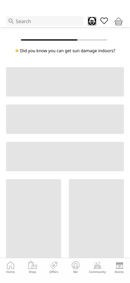
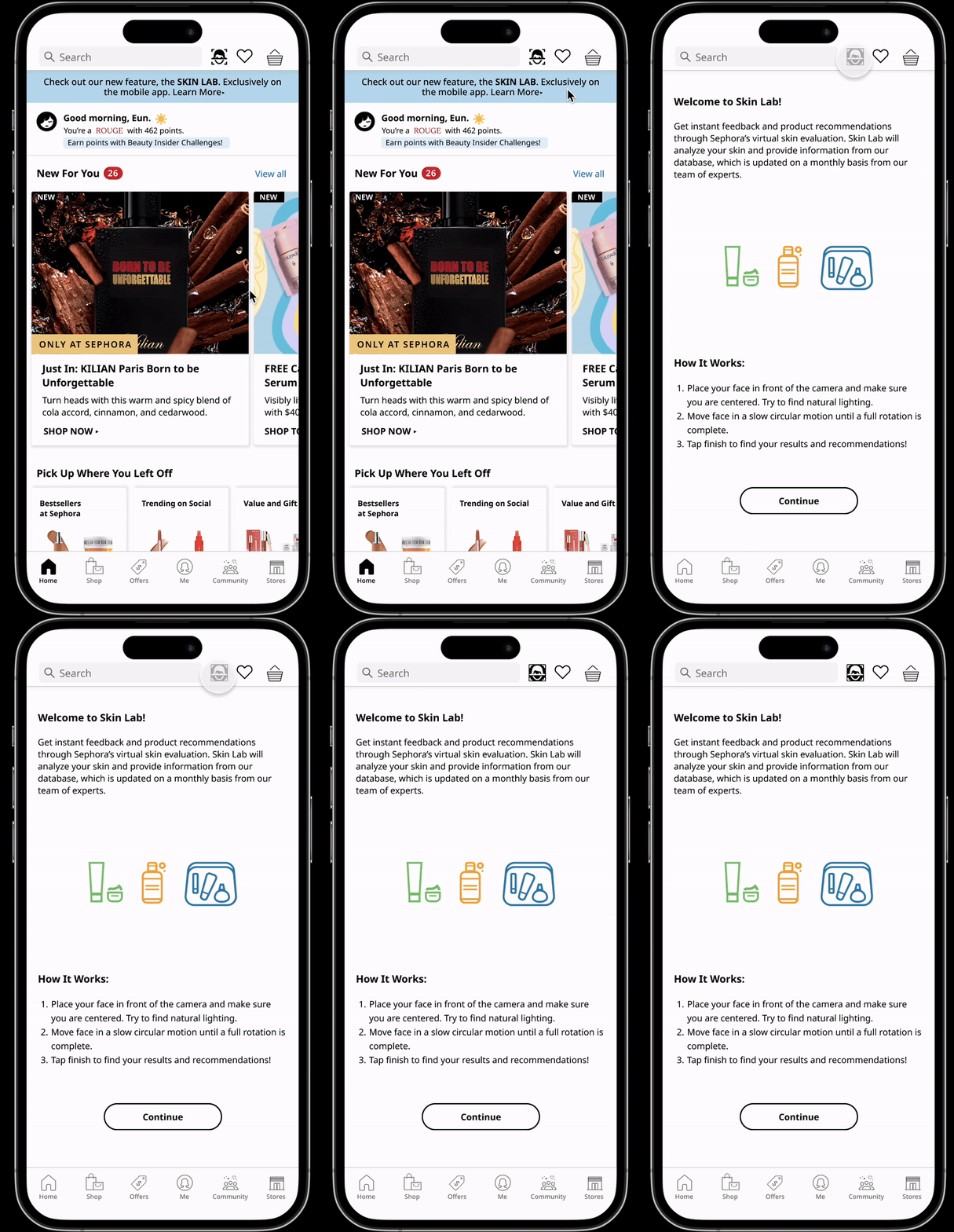
Option 1 explores the feature with the entry point beginning at the top navigation.
Left sketch explores an icon within their top navigation while the right sketch would have the icon button within their bottom navigation.
Wireframes
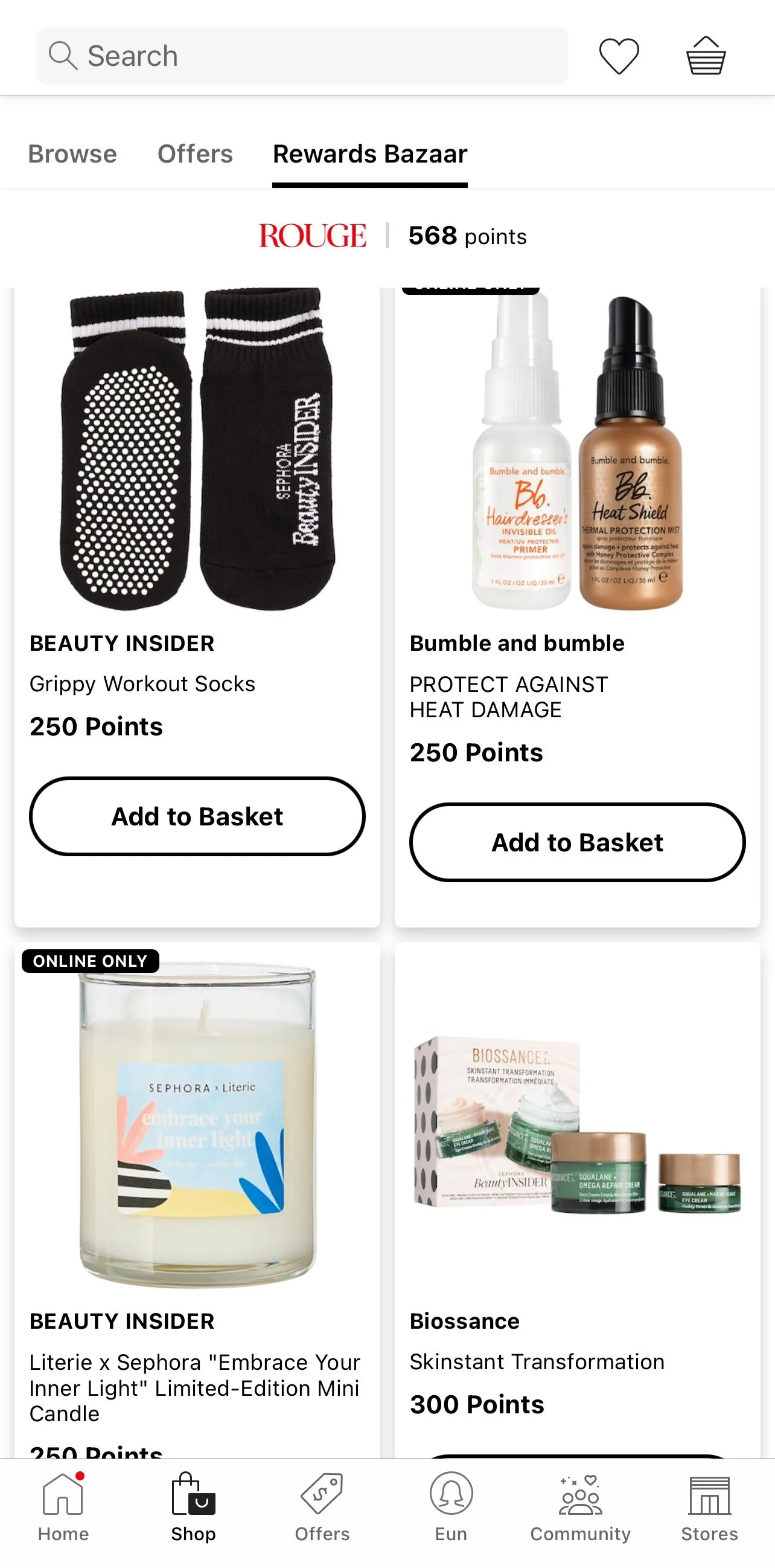
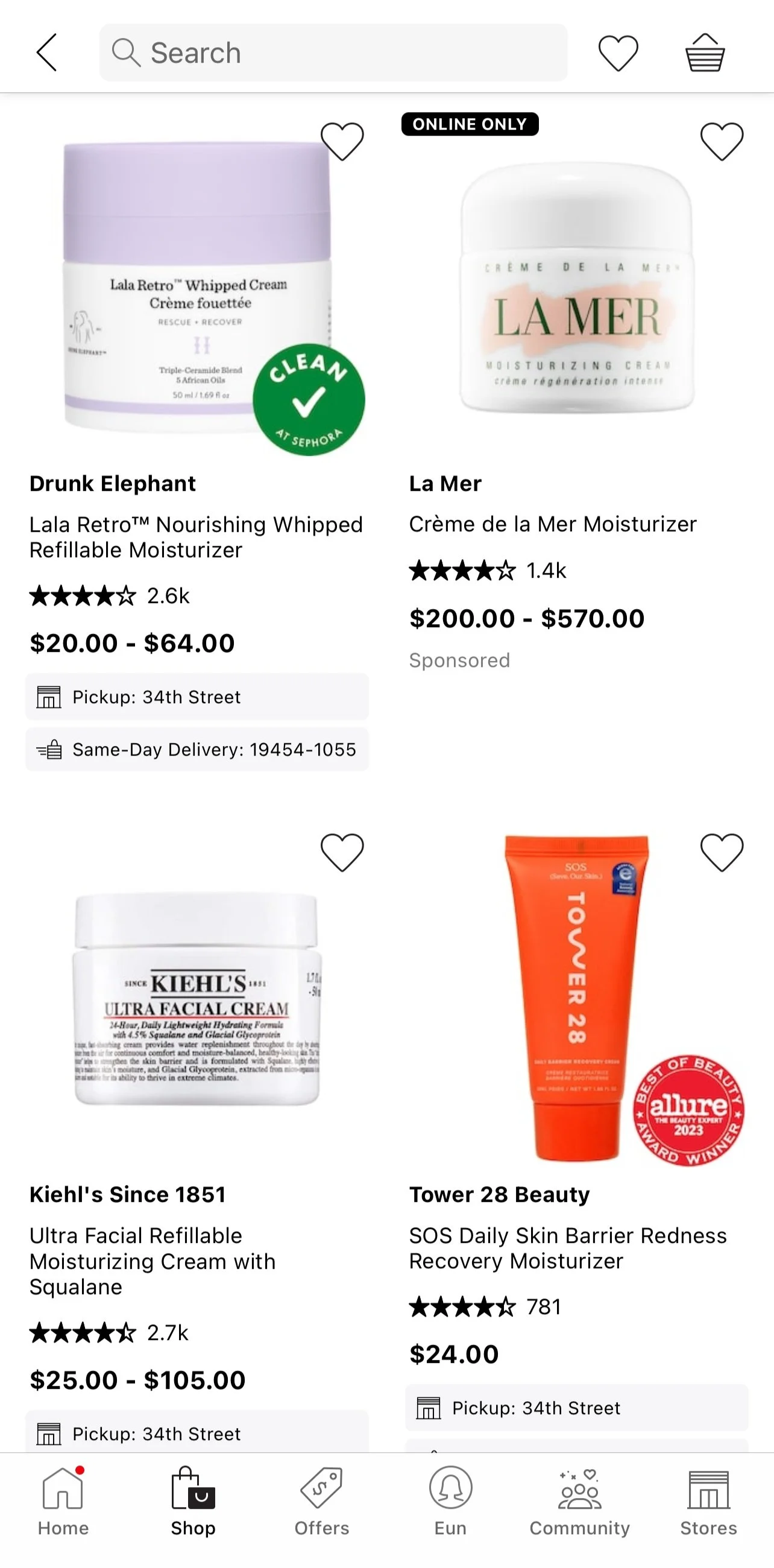
Displayed on the right side is an example of how extensive and inconsistent the Sephora app is. Different pages has different layouts and details such as margins, drop shadows and spacing are all varying in sizing and styling.
Sketching
To mitigate the problems, I decided to use a blend when portraying the product listing. Additionally, I paid close attention to margins, following as closely to the app as possible. From here, I began building out the two options.
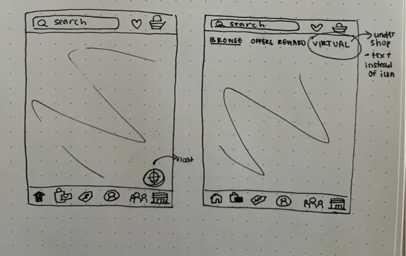
Left sketch explores a floating icon in the bottom right corner while the right sketch would have the feature placed within their shop page under their own category.
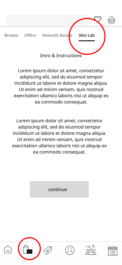
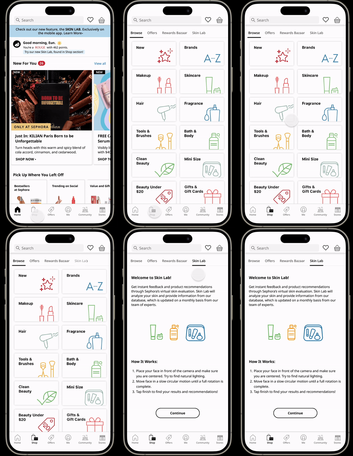
I decided to begin wireframing with these two ideas. The left side has quicker access as it’s a one step tap to activate the feature while the right side explores a more user and business mindset. The feature itself wouldn’t be as important to the bottom line and would be more of an added experience, so having its own category under the shop page would allow it to have its place without having a callout in their main page and navigation.
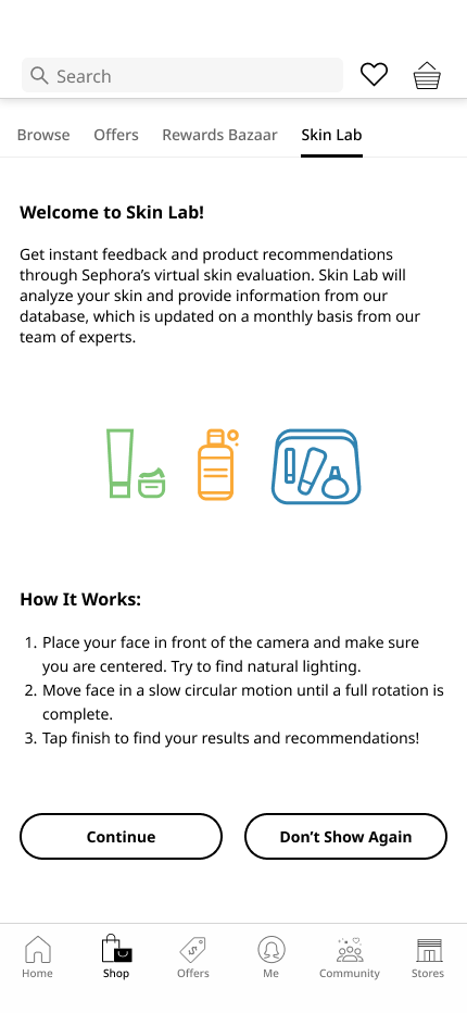
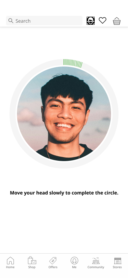
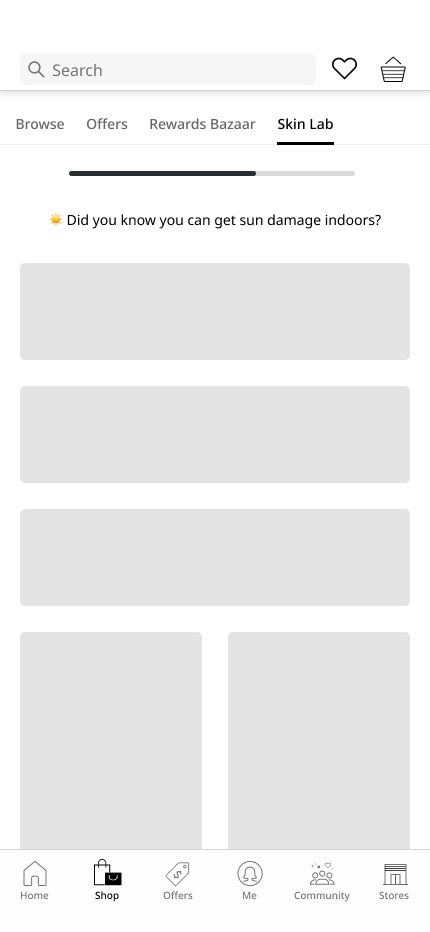
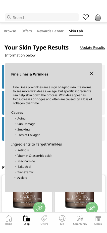
Option 2 explores the feature with the entry point found within the shop page under its own category “Skin Lab”.
Jump to the prototype for a unique experience.
Testing & Iterations
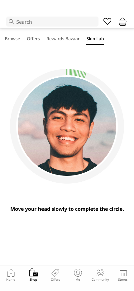
After creating the two different prototypes, I began conducting user testings. The task was to get a skin analysis and product recommendations with the different entry points.
VS
User Testing
75% of participants preferred the first flow, where the entry point is found on the top right of the navigation. They found that it was quicker to access the feature and the design did not disrupt the current app experience over all.
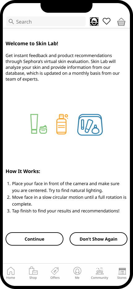
From the tests, I revised on details such as inconsistencies with spacing and copyrighting as well as button placements. With more time, I would have liked to research more on AI capabilities when it comes to skin analysis in comparison with what is currently in the market. This would be beneficial for Sephora, as it would help improve the experience of the feature. A better understanding of AI technology would help improve the feature to make it an enjoyable process for users.
Wrap Up
This project has introduced the struggle of creating a feature within an application that has constraints. With more time, I would like to continue to iterate on the results page, so that the product recommendations and skin report is more aligned to Sephora’s branding. Additionally, it would be nice to be able to test and receive more feedback on the type of information users would deem more beneficial with the feature. Overall, this case study was a great learning experience.

